UI-REDESIGN
SØRGENSON – a Denmark-based design company specialised in furnitures.
TIMELINE
October 2021
DELIVERABLES
UX/UI-Design, User flow, 10+ Mobile screens
TONE
Functionality, durability, innovative, earthy & modern
Wireframes
Here some of the first wireframes that demostrates the design thinking aligned with user research.
Colors & Fonts
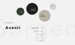
Defining the visual Language & the Tone of the brand
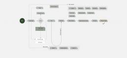
User Flow
Responsive Design
All designs were created for all the screens: Desktop, Tablet, Mobile. The design is coherent with mobile app. For the project I designed 10+ mobile screens, here some of them:
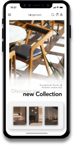
HOMEPAGE
User can easily access to different categories on the frontpage and browse for the selections and found out what they would like purchase.
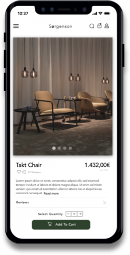
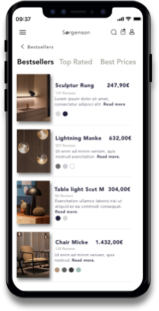
PRODUCT PAGE
User can access product details and be informed about the materials, reviews, colors and prices.
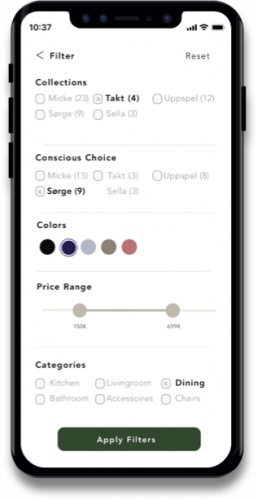
APPLY FILTERS
Users can easily filter different options and customize their search according to their needs.
CATEGORIES
Users can easily filter different options and customize their search according to their needs.
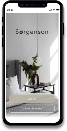
ONBOARDING
Easy access to onboarding the membership system.
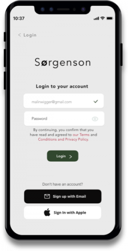
LOGIN PAGE
Easy login or sign-up for users. The guest mode allows uders browse the product before registering.
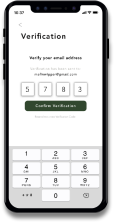
VERIFICATION
Users can easily filter different options and customize their search according to their needs.
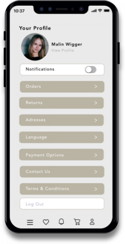
PROFILE PAGE
User can access and modify their information as follow up their orders with the memebership system.
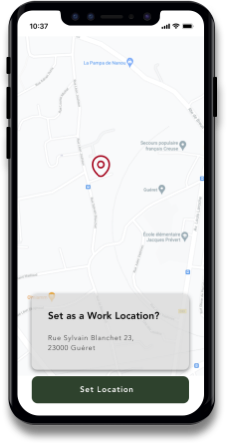
LOCATION
User can easily set different location according to their needs.
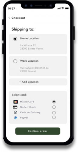
CHECK OUT
Easy view and modify orders in the shopping cart. And then go to checkout which is easy to choose for different shipping options and payment methods.
IMPACT
+41,36%
Leads per user
+60,44%


