SCANDINAVIANLIVING
SLOW HOMESLet's be inspired by nature!
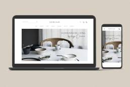
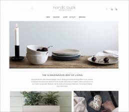
Nordic Butik is high-quality online store inspired by Scandinavian nature: a shared passion for sustainable, fine textiles and handcrafted products of high quality to celebrate the slower pace of life. A holistic lifestyle for those who appreciate the art and soul of meaningful products, whether it’s in the house, garden, or a personal furniture, made just for you.
.
CASE SUMMARY
CHALLENGE
For customers interested in scandinavian interior design, it is difficult to find sustainable furniture in that style with transparent manufacturing and clearly stated ecological footprint. It is also challenging for customers to find information on easy ways to change their own consumption behavior to support the sustainability of their interior design.
VISION
Whilst our competitors focus on taking the pain out of the scheme, our vision was to help users get more pleasure out of it. We wanted to become an enabler for a better home. Website to bring sustainable Scandinavian brands together with conscious customers and help people make decisions that are based on their values and are easy to make without long research – improve well-being at and to home. At the same time, build responsive, user-friendly ecommerce website and support a long-term change in consumer behavior and make a positive contribution to the environment.
OUTCOMES
Website and shop to offer a selection of ecological products in the Scandinavian style in order to provide information to customers to support their Scandinavian lifestyle sustainably and at the same time build a compelling business case for further development opportunities.
"FOR THE SIMPLE WAY OF LIVING!"
PROJECT TEAM CONSISTED OF
METHODOLOGY
Design thinking driven product concept development using followed tools: Figma, Sketch, Photoshop, Lookback App
PROJECT PLAN
2 weeks of discovery and ideation, followed by 2 weeks of prototyping and demonstrator production
MY RESPONSIBILITIES
Empathize
DISCOVERY & IDEATION
In preparation to dive into my research, I first set some clear goals and created a research plan that would guide my research process. After that I started by researching the existing market (Competitive Analysis) tailored for Scandinavian living and interior design.
Research Goals
- Understand the market trends of the furnishing and living industry
- Identify Nordic Butik’s target market
- Identify Nordic Butik’s competitors and evaluate strengths and weaknesses
- Identify opportunities for refreshing the Nordic Butik´s branding.
- Identify best practices for organizing information and products on the Nordic Butik’s website and shop.
- Identify strategies for the onlineshops to provide better user experiences and meet user needs through an online platform.
- Identify the demographics of customers who will be interested in the Nordic Butik’s onlineshop.
- Understand customer pain points that could make shopping or reading to an onlineshop difficult
Competitive Analysis
User Interviews
After competitive analysis, multiple forum reviews and questionnaires, I gathered 23 responses, primally via social networks for the interior design, such as Houzz. This data allowed me to paint clearer picture of the issue’s customers have to face when they want to find inspiration and information about sustainable Scandinavian products. This information provided me with enough information to build user profile for further research.
Four people that fit into the demographics were interviewed. In these interviews, I focused on asking open-ended questions, keeping the research goals that I set in my research plan in mind:
- Identify what motivates customers to shop online vs. in store
- What factors influence your decision on which onlineshop to shop?
- Discover pain points customers encounter when shopping sustainable online/offline
- Determine what factors into a great online shopping experience
Empathy Map
After gathering all the information gained from the interviews, it was now time to do a deeper analysis by using an empathy map.
While interviewing customers and reviewing multiple studies I found that detailed information about product sustainability and ecological delivery and convenience are the key aspects to behavioral change and motivation. Countless subjects reported that having a reliable shop offering authentic scandinavian and ecological products makes every shopping session joyful. In the end these people spend countless hours searching suitable sustainable products in Scandinavian style so there´s a need for a solution to help them find ecological products online that suit their scandinavian art of living.
CONVENIENCE
Many users discussed the convenience of shopping online .
PRODUCT SUSTAINABILITY
Many users mentioned being motivated by transparent information and getting better awareness of how and where products are made while shopping online.
DELIVERY
Users shared about their experiences (both positive and negative) with the shipment and delivery of their online purchases.
DEFINE
IDEA PRIORISATION
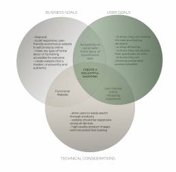
Based on discovery research findings defining and understanding the individual goals, along with the larger, mutual project goals, helped pave a clearer path when making decisions throughout the design process.
To achieve these goals, was important to prioritize what kinds of features would be needed. The features were prioritized based on technical complexity (POC only), potential business and user efficiency values as well as what was most essential solution in order to meet the project goals.
IDEATE
INFORMATION ARCHITECTURE
Site Map
This maps out all the features and categories that the Nordic Butik website and shop want to offer in a basic attempt at site hierarchy and organization. We strived to eliminate pointless categories that so often clutter a onlineshops, and also to include navigation space for online journal.
Task Flow
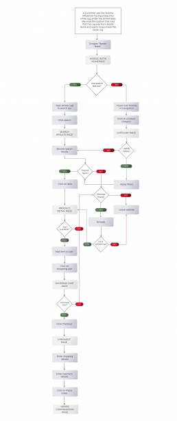
To better understand how users would be completing key tasks on Nordic Butik’s website, I started by creating task flows. Creating these task flows helped me identify the key tasks the users would complete and the key screens that users would be interacting with.
User Flow
Diving deeper, in order to empathize with users further, I created user flows in order to better understand their different paths and overall journey interacting with the website.
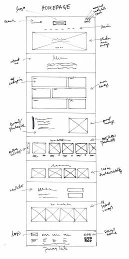
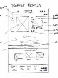
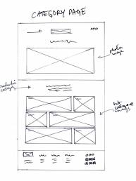
LO-FI Sketches
Taking what I have learned through the process to this point, we started to make decisions on how the the content on Nordic Butik´s website would be organized based on the project goals we want to meet.
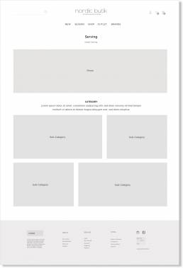
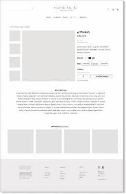
Mid-Fidelity Wireframes
Taking the lo-fi wireframe sketches, I worked on digital versions of some of the key pages to solidify the layout of the website. I added just enough information for users to be able to navigate through the pages and complete tasks I would present to them during usability testing. These mid-fidelity wireframes would help my focus on what needed to be improved in terms of the functionality of my design. I also created tablet and mobile versions to make sure that the design is responsive and effective across the different device screens that users would be accessing the website on.
PROTOTYPE
VISUAL MOCKING & PROTOTYPES
Branding
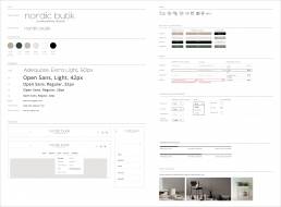
Before working on the UI design, I worked on refreshing Nordic butik’s branding to effectively communicate their unique brand personality through their website. To begin the branding process, I started by creating a mood board for inspiration and to set the direction that I wanted to take Nordic butik’s branding. I focused on finding different elements (color, typography, imagery, and logos) that aligned with their brand attributes: earthy, high-quality, elegant, and contemporary.
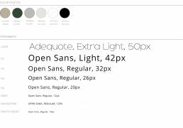
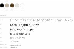
I styled few versions as an early exploration toward a visual style for the Nordic Butik brand. The colors were influenced by the palettes of Scandinavian nature, as well as UI designs I found during inspiration gathering on sustainable Scandinavian manufactures. I focused on typography that I felt embodied a high-quality, timeless yet modern.
UI Kit
Using moodboards as a guide, I applied Nordic butik’s branding to UI elements, including the color palette, typography, icons, along with buttons, navigation bars, and progress bars in their various states to help with the coherence of the design moving forward.
High-Fidelity Wireframes
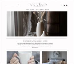
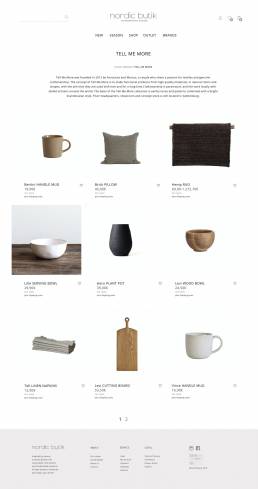
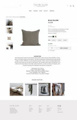
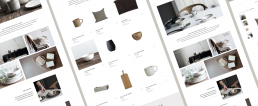
Incorporating visual elements in line with Nordic butik’s branding, I worked on the UI design of the website and created high fidelity wireframes.
High-Fidelity Prototype
TESTING
VALIDATION
Usability Testing
POC prototype has been tested on 6 users, between the ages of 25 and 65 in order to validate our goals/ hypotheses. We used previously defined storyline to guide users through the prototype. We used Lookback app to record realtime user interactions to review and compare test sessions later. We also wanted to capture anecdotal evidence and input which we could use for potential business case development.
We observed lot of positive feedback regarding to the authentic look, the ability to find more detailed information about sustainability in the journal, to know they are making the best purchasing decisions, to know they will receive their purchases on time etc. However, some people had some confusion on navigation and information labels on product detail page.
Task Flow
- Learn more about Nordic Butik´s background.
- Find out if Nordic Butik delivers to Melbourne.
- Access the “Sustainable paints” article.
- Subscribe to the Nordic Butik Newsletter
- Sign in to your account
Summary
- Method: Remote, usability testing Lookback App
- Participants: 6
- Age: 25-65 years
- Average Time: 7 minutes
- Task Completion Rate: 100%
- Error-Free Rate: 99.2%
Based on the findings from the both UX research and POC validation sessions we were able to come up with the list of changes that were addressed and updated in the prototype. Established product keywords and navigation lack the ability to find the suitable product size effectively. The verification for invoice-payment option need to be placed earlier in the payment process. Through this approach by testing mid-fidelity designs to put a focus more on the logical structure of a website’s design before finalizing the visual design, was really effective in quickly identifying initial roadblocks to user’s goals in the design and to make sure that the overall layout of content itself is effective and functional.
OUTCOME
THE IMPACT & NEXT STEPS
The Impact
The Nordic Butik shop has received both positive and negative feedback. Users have responded well to the shop’s features and the simplistic redesign. Unfortunately, negative feedback largely relates to the delivery options and accuracy of searching products— definitely subject to ongoing improvements.
38%
IMPROVED CONVERSION RATE
15%
REDUCED BOUNCE RATE
31%
INCREASED AVERAGE ORDER VALUE
For confidentiality reasons I have omitted the actual values for these metrics.
“Just wanted to Congratulate Nordic Butik on the new-look web site. I know it's been a while since I ordered, but have browsed today and am very impressed with how easy it is to use. Well done!”
- Anonymous Website Visitor
“Makes life a lot easier and gives the option to print off info for my clients during the interior design process. Thank you … ”
- Vanessa Meyer, Interior designer
“A must for the scandilover. Even if you re not shopping you can still benefit from the information about sustainability at home that you can't get on the other shops.”
- Claudia Greif, customer
Next Steps
PROTOTYPE ADJUSTMENTS
- I will adjust various aspects of the prototype based on user feedback from my usability testing.
RE-TEST
- I will pursue more usability testing on the updated and enhanced features of the prototype and validate the changes made and observe if any further improvements need to be prioritized.
FUTURE IMPLEMENTATIONS
- With the timeline of this project, I could only focus on the top prioritized features to meet our project goals. However, I think there’s room to add more value and delight to the experience by implementing other features referenced on the product roadmap.
